
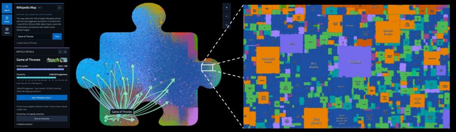
A new interactive map of the most popular articles on English Wikipedia is now available. You can use wikipedia-map.net to search for articles, explore them as colorful puzzle pieces, zoom in, and trace how readers move from one article to another. The size of each piece represents popularity, its color helps identify the topic, and the selected article’s panel also displays its quality score.
You start with an article about a film, move on to an actor’s biography, and a few clicks later find yourself reading about the city where they were born. Wikipedia lends itself to these journeys. Wikipedia Map visualizes the patterns behind them: hundreds of thousands of articles appear as colorful puzzle pieces, with arrows showing how readers move between them.
The visualization brings together three perspectives: what an article is about, how much attention it receives, and how readers navigate to and from it. This lets you explore the encyclopedia spatially — zooming into an area, finding a familiar article, and discovering which links readers follow most often.
720 thousand pieces of one puzzle
Version v0.1 of the map contains 720,388 English Wikipedia articles. These represent the 10% of articles with the most pageviews during the period from July 1, 2025, to June 30, 2026. This twelve-month window offers a broader view of interest in different topics than a ranking based on a single day or month.
The selection of the most popular articles matters when interpreting the map. The puzzle does not include all of English Wikipedia or all of Wikipedia’s language editions. It focuses on the part of the encyclopedia that attracted the most traffic during the period studied.
The individual pieces form the outline of one large jigsaw piece. This shape reflects the idea behind the project: each article is a distinct piece of knowledge, while its connections to other articles provide a broader context.
Puzzle size: how do we measure interest?
The area of each puzzle piece depends on the article’s pageview count, following additional checks and corrections for anomalous traffic. A larger piece indicates greater popularity according to this measure during the selected period. This provides an intuitive way to compare articles: instead of reading thousands of numbers in a table, you can see which articles occupy the most space.
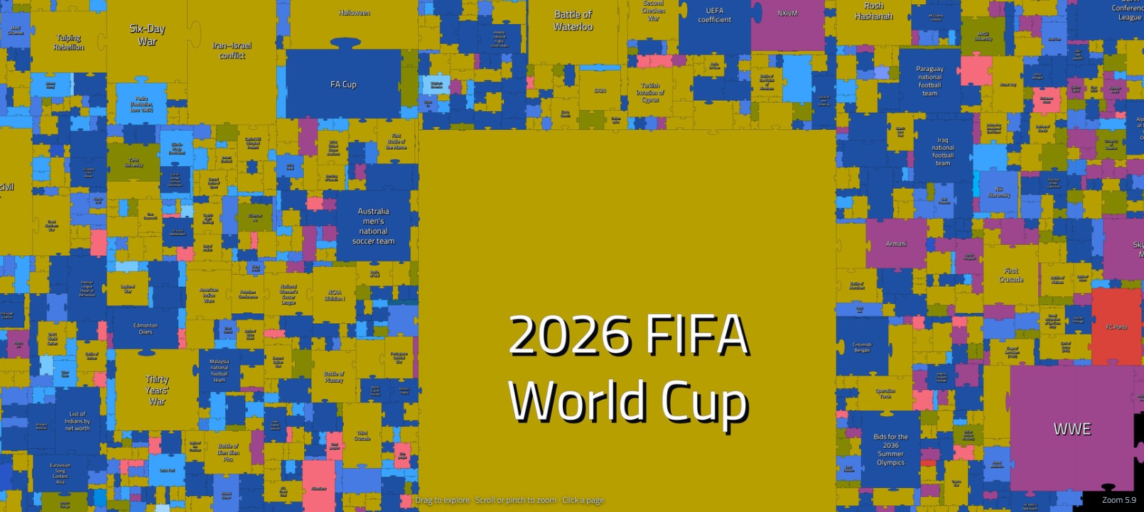
These counts were calculated using Wikipedia pageview data downloaded from analytics data dumps (Wikimedia Pageviews). Pageview statistics determine popularity and puzzle size, while a separate Clickstream dataset is used to draw the connections between articles.
Only pageviews classified by Wikimedia as user traffic (agent=user) were included. The measurement criteria are described on the pages Wikipedia:Pageview statistics and Research:Page view. Because the user designation is the result of a classification process, it does not by itself rule out every possible distortion in the statistics.
Pageviews do not count unique people. The same reader may open an article several times, and each visit may increase its pageview count. Popularity is not a judgment of a topic’s value, either: a small puzzle piece may represent an important subject that serves a limited audience.
When the numbers need a closer look
Even after selecting traffic classified as human, unusual patterns can inflate the apparent popularity of some articles. The raw totals used in the map were therefore subjected to additional checks, and identified distortions were corrected. The general approach was partly inspired by methods discussed by WikiRank in its article on unusual popularity measurements: pageview counts are assessed alongside contextual information about the article.
Potential signals that warrant closer examination include:
- the shape of the daily pageview time series, including unusually high, sustained traffic without an identifiable cause;
- extreme differences between desktop and mobile traffic;
- changes in the number of edits and active editors;
- restrictions on editing an article, such as page protection;
- changes in the number of links and references;
- search engine interest in the topic;
- major news events related to the subject;
- traffic patterns in comparable Wikipedia articles.
No single signal proves that traffic is artificial. A film release, an election, or a major discovery may fully explain a sudden increase in pageviews. The checks help distinguish this kind of interest from patterns that suggest a distortion in the measurement.
Another useful methodological example is Pew Research Center’s 2026 analysis of Wikipedia. In addition to filtering out automated traffic, the researchers applied a criterion based on the share of mobile pageviews: they excluded pages where that share was below 5% or above 95%. These thresholds illustrate the approach used in that study; they do not describe the thresholds applied to this map.
Colors and topics: how are articles classified?
The articles were assigned to 44 topical categories, including biographies, films, television series, books, organizations, cities, and technology-related subjects. Each category has an assigned color, with many biography categories using shades of blue. The legend is useful for identifying topics, as some categories share a color.
Topics were identified using the content of Wikipedia article abstracts and statements in the corresponding Wikidata items. An abstract provides a textual summary of an article, while Wikidata supplies structured information about the entity it describes. Combining these sources helps determine whether an article is about a person, a film, an organization, or a settlement, for example.
The classification may need refinement, particularly when a subject spans several fields. Future versions of the project are expected to improve classification accuracy and expand the range of topics, allowing the map to better reflect the encyclopedia’s diversity.
The placement of pieces takes both topic and navigation links into account. Nearby articles may therefore reveal groups of related subjects, but distance should not be treated as a precise measure of similarity. The layout is a way of organizing a very large network.
Arrows: where do readers go next?
The map’s dataset contains 21,385,140 distinct directed connections. This is the number of source–destination article pairs, rather than the total number of clicks. Each connection has a weight: the number of recorded transitions.
This layer is based on Wikipedia Clickstream data published by Wikimedia Foundation. The dataset describes transitions between pages in aggregate. The map uses connections of type link — transitions between articles along existing hyperlinks — and excludes visits originating from search engines and other websites.
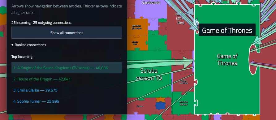
Selecting a puzzle piece displays up to 25 top incoming connections and 25 top outgoing connections on English Wikipedia during the period from July 2025 to June 2026. Incoming connections show which articles readers came from; outgoing connections show which articles they visited next. The two directions have separate rankings, and a thicker arrow indicates a higher position in its respective ranking.
For example, a connection from a film article to an actor’s biography may suggest an interest in the cast. It does not, however, reveal any individual reader’s motivation. The data is aggregated and does not reconstruct individual reading sessions. Very infrequent transitions are also omitted from the published Clickstream datasets, so the absence of an arrow does not prove that nobody has ever moved between two pages.
Popularity and quality: two different questions
Clicking an article opens a panel showing its topic, statistics, and quality and popularity indicators. The distinction matters: pageviews indicate interest, while the quality score concerns how well the article is developed.
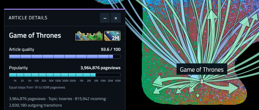
Quality is shown on a scale from 0 to 100 points. The progress bar changes color as the score reaches successive bands. The link next to the score and the icons lead to the corresponding article on WikiRank, a service that automatically evaluates and compares Wikipedia articles. The score should not be interpreted as the percentage likelihood that the content is true, or as a substitute for examining the references.
The popularity bar uses a different scale. Equal segments correspond to increasing pageview thresholds, from thousands to tens of millions. This makes it possible to compare articles with very different levels of traffic without reducing every less popular article to an almost invisible sliver. The length of this bar does not increase linearly with the number of pageviews.
Looking at the two indicators together raises interesting questions. Is a widely viewed article also well developed? Does a detailed article remain relatively unknown? The map helps identify such cases; explaining them requires a closer look at the content and the context behind the interest.
A small experiment in curiosity
You do not have to start with the largest pieces. Choose a topic you know and explore its surroundings:
- Search for an article. A good starting point is the English title of an article about a favorite film, writer, city, or discovery.
- Compare size and topic. Zoom in and check the category of the selected piece.
- Explore traffic in both directions. Open the connection rankings and compare where readers came from with where they went next.
- Check quality and sources. Visit WikiRank or open the Wikipedia article to learn more.
To see when interest in a particular article increased, try Pageviews Analysis, which lets you compare article pageviews over time. When comparing totals, remember that the map applies additional corrections, so its values may differ from unadjusted statistics. WikiNav also lets you explore incoming and outgoing traffic using Clickstream data.
Mapping knowledge and attention
Wikipedia Map presents the encyclopedia as a network of connections, showing both its topics and the patterns of readers’ navigation. One article may be the destination of a search; another may be a stepping stone to further discoveries.
The map represents a particular set of articles over a particular period, rather than a universal ranking of knowledge. Its strength lies in the questions it invites. Why is this piece so large? What connects these articles? Where does the next arrow lead? Any of these questions could be the start of another journey through Wikipedia.
Sources and useful tools
- Wikipedia:Pageview statistics — interpreting pageview statistics.
- Research:Page view — the definition of a pageview in Wikimedia projects.
- Wikimedia Pageviews — documentation for pageview data dumps.
- Wikipedia Clickstream — the dataset and how it is prepared.
- Wikimedia — public Clickstream datasets.
- WikiRank — the quality and popularity of English Wikipedia articles.
- WikiRank — examining unusual popularity statistics.
- Pew Research Center — a 2026 analysis of Wikipedia.
- Pageviews Analysis — comparing article pageview counts.
- WikiNav — exploring transitions between articles.